Citizens Bank Find An Advisor
A UI/UX design case study on creating an experience for a Citizens Bank customer to get connected with a financial advisor.
Overview
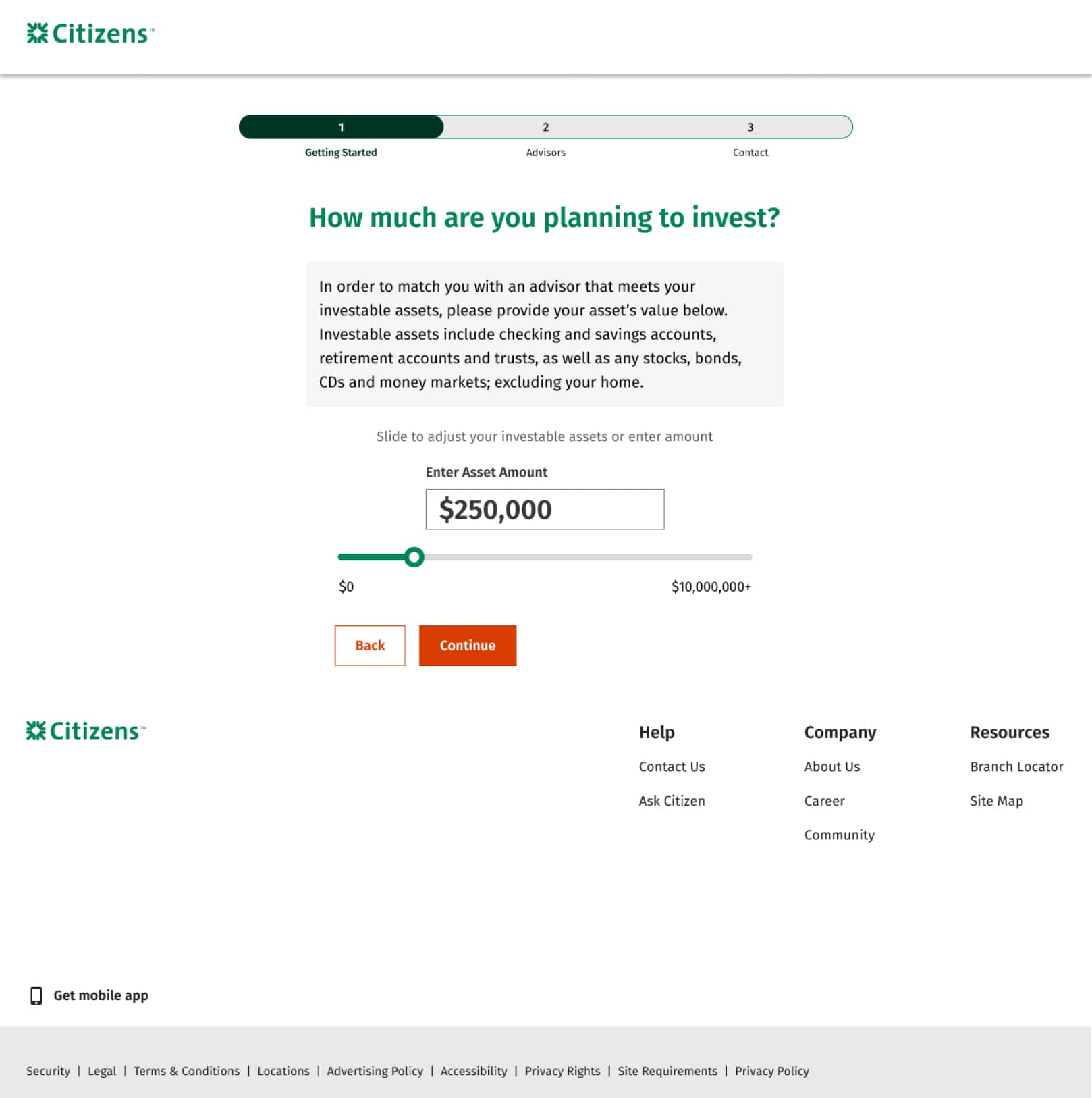
The ‘Find an Advisor’ case study stemmed from a directive by business partners aiming to boost customer conversion rates on the Citizens Wealth Management page. Extensive research unearthed an alarming 80% drop-off rate at the initial step of portal entry. Further analysis uncovered user dissatisfaction with the initial inquiry, specifically the requirement to disclose investable assets via radio button selection. This approach fostered feelings of exclusion among users, raising concerns about service quality disparities based on their asset position.


The Approach
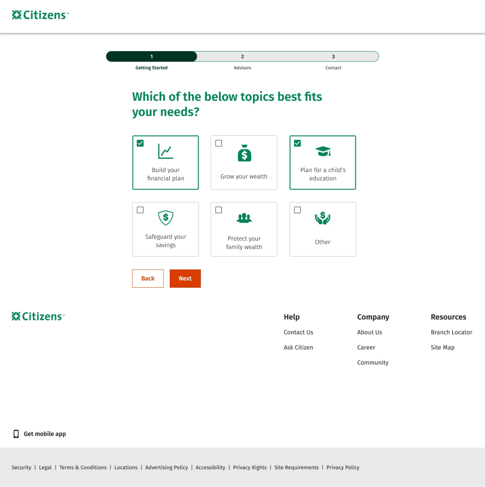
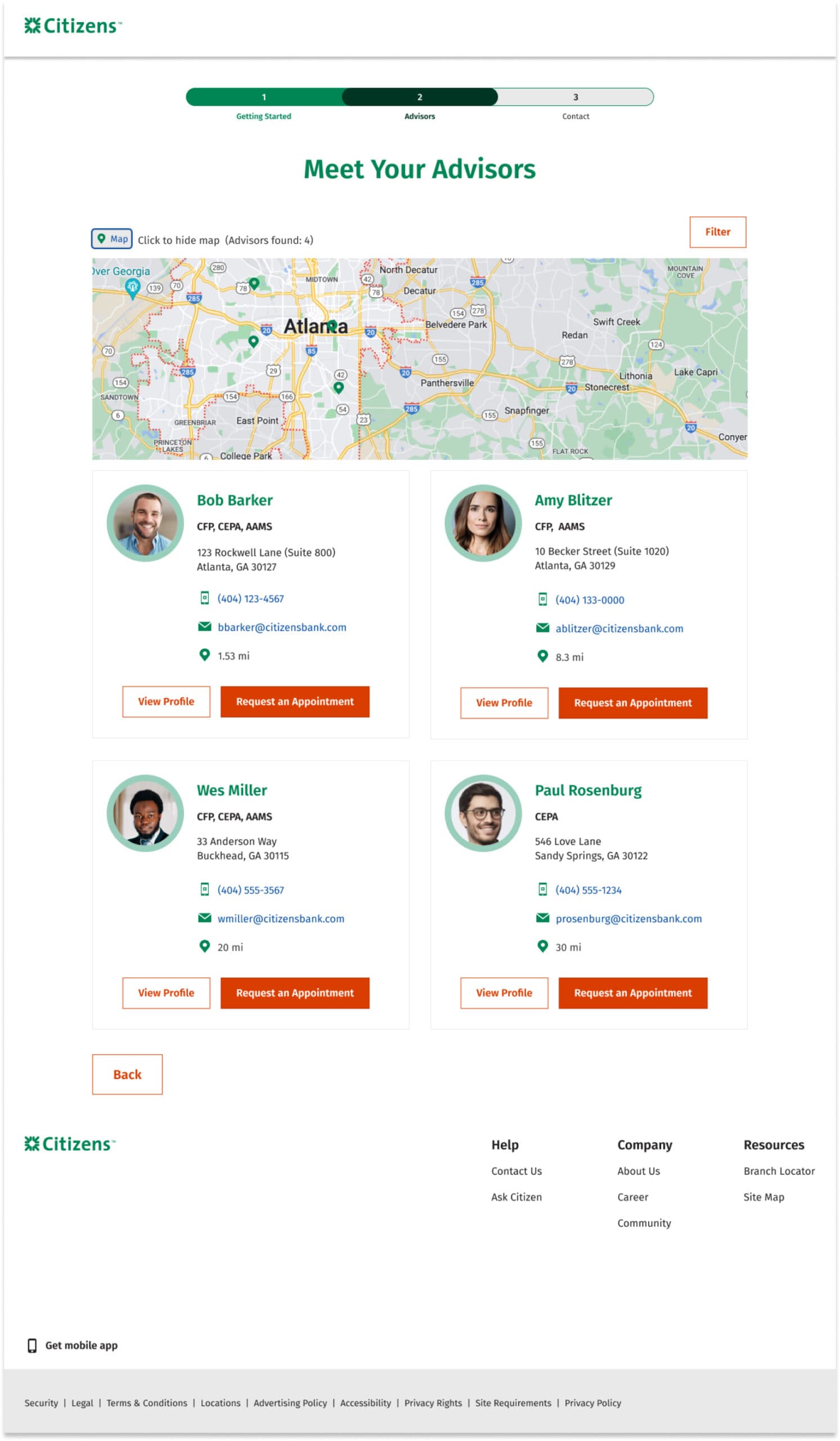
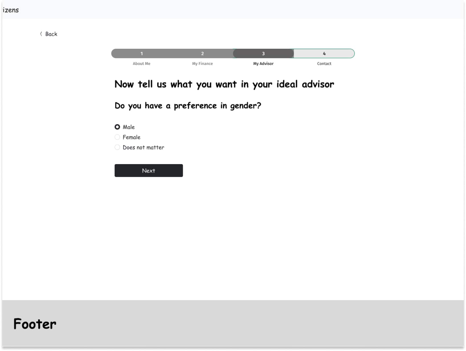
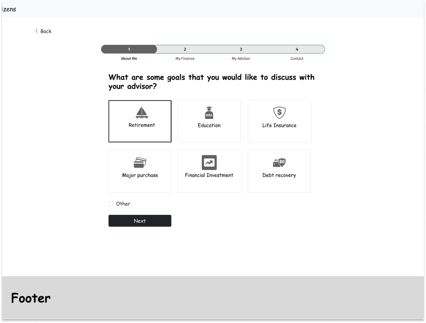
The UX team initiated the project through close collaboration with business partners to grasp and enhance key objectives for improving the overall user experience. Through these discussions, we identified crucial pain points and developed strategies to customize the user journey, all with a “Blue Sky/North Star” approach. Proposed initiatives include prioritizing a customer-centric experience, directing potential wealth management clients towards their next steps based on their current circumstances, offering users the flexibility to choose an advisor according to preferences such as gender, age, and availability, and creating an avenue for users to connect with an advisor or access the Wealth Checkup experience for additional assistance before making their final decision.
UX Stratergy
- Conducted stakeholder interviews to review and discuss project scope and requirements.
- Performed a competitive analysis of competitors offering similar services, including Chase, Vanguard, and Edward Jones.
- Developed user personas, storyboards, and user flow diagrams aligned with business requirements.
Produced initial greyscale wireframes. - Collaborated with business stakeholders to review and refine designs.
- Executed unmoderated tests using usertesting.com.
- Iterated on the user experience, incorporating research findings.
- Delivered final design recommendations based on research results.
The Wires
Aligned with the business requirements and adopting a “North Star” approach, our initial focus was on developing early greyscale wireframes. These wireframes aimed to directly tackle the business goals and cultivate a cohesive user experience. Key focus points encompassed:
- Guiding the user through the experience
- Personalizing the experience
- Providing alternative options for advisory search
- Providing options to customize their advisor based on preferences
Wireframes


The Research
Three unmoderated user tests were conducted on usertesting.com, targeting different areas of business concerns such as user drop-off, personalization, and overall experience. The test results indicated that the majority of users did not encounter difficulties in providing their investable assets to be matched with an advisor. However, they expressed a preference to furnish this information at a later stage in the overall user experience.
Frequently, users abandon the completion of a web form, particularly when prompted for sensitive information. This behavior stems from a mix of psychological, technical, and design-related factors. Here are some key reasons:
- **Privacy Apprehensions**: Users are becoming more conscious of online privacy risks and data breaches. When prompted for sensitive information such as personal identification, credit card numbers, or Social Security numbers, there is a heightened concern among users that their data might be compromised, potentially resulting in identity theft or other security breaches.
- **Trust Concerns**: Users must have confidence in the website or platform when sharing sensitive information. If the website lacks a trustworthy appearance, essential security features (such as HTTPS), or has a track record of data breaches, users are inclined to abandon the form due to trust-related apprehensions.
- **Lack of Clarity**: If the purpose of collecting sensitive information is not clearly communicated, users might be hesitant to proceed. They might wonder why the information is needed and how it will be used.
- **Unclear Purpose**: When the purpose behind collecting sensitive information is not effectively communicated, users may hesitate to proceed. Questions about why the information is needed and how it will be utilized can create uncertainty, leading to user reluctance.
- **Perceived Effort**: When users feel that the effort demanded to complete the form exceeds the anticipated benefits, they are prone to abandonment. Lengthy forms or those with an excessive number of obligatory fields can be overwhelming, contributing to user reluctance.
- **Technical Challenges**: Issues like slow loading times, errors, or compatibility problems across various devices can dissuade users from completing the form.
- **Lack of Mobile Optimization**: When the form is not tailored for mobile devices, users on smartphones and tablets may encounter difficulties in completion, potentially resulting in abandonment.
- **Anxiety**: Providing sensitive information can trigger feelings of anxiety, especially when users are unfamiliar with the website or if the form’s design raises suspicions.
- **Social Pressure**: Users may find themselves completing the form in a public space or in the presence of others who could potentially view their sensitive information. This social pressure might prompt them to abandon the form in order to uphold their privacy.
- **Absence of Incentive**: When users fail to perceive a clear benefit or incentive for completing the form, they may question the value of sharing their sensitive information.
Hi-Fidelity Designs